


The Revolutionary Nature of Richard Hamilton’s Final Design was in its Utter Simplicity
Where do you go after your last album cover broke all the rules in terms of creativity and cost? In the wake of the groundbreaking sleeve design for Sgt. Peppers Lonely Hearts Club Band, the Beatles turned once again to gallery owner and Pop Art devotee Robert Fraser.
As the person who had introduced the group to Sgt. Peppers designers Peter Blake and Jann Haworth, Fraser had just the man for the next Beatles project, Richard Hamilton. By the 1960s, Hamilton was showing with Robert Fraser, who was arguably one of the most influential gallerists of his era.

Richard Hamilton in his studio at 25 Hurst Ave. in Highgate, London 1970. Photo: Chris Morphet/REDFERNS
One of Hamilton’s most enduring series, “Swingeing London,” was based on news photos of Fraser’s infamous drug-possession arrest with Rolling Stones frontman Mick Jagger, during a party at guitarist Keith Richards’s country home. Fraser was the one who introduced Hamilton to McCartney, and, knowing he had already commissioned and rejected two other attempts at the cover art for the new album, suggested the singer hire Hamilton. While John Kelly took the portraits in the gatefold sleeve, McCartney gave Hamilton three tea chests full of photographs for the collage, Hamilton’s primary media at the time, for the poster insert.
Paul McCartney requested the design be as stark a contrast to Sgt Pepper’s day-glo explosion as possible… he got it!
~ Richard Hamilton
Hamilton explained, “Paul McCartney requested the design be as stark a contrast to Sgt. Pepper’s Day-Glo explosion as possible… he got it.” The 45-year-old artist came up with the plain white cover with the words The Beatles embossed on it, and a serial number to indicate a limited edition pressing although there seems to be some question as to whether two or five million albums featured the serial number. His earlier ideas to feature a coffee cup stain on the cover or impregnate the cover with apple pulp in honor of the newly formed Apple Corps were considered too flippant, and impractical.
However, Hamilton’s idea to call the new double album simply The Beatles was taken on board. Released in November 1968 it was immediately dubbed the White Album. The cover featured a unique stamped number, to create in Hamilton’s words, “the ironic situation of a numbered edition of something like five million copies.” Hamilton intended the cover design to resemble the look of conceptual art, an emerging movement in contemporary art at the time.
.")
Peter Blake’s iconic sleeve design for Sgt. Pepper
 (1968).")
Hamilton’s minimalist sleeve design for The Beatles
Hamilton’s design contrasts strongly with the exuberantly colorful and busy cover for Sgt. Pepper designed by Hamilton’s former student, Pop artist Peter Blake and his wife Jann Haworth. Perhaps because Blake’s cover is so deeply inspired by Hamilton (it is much more Hamiltonesque than the White Album cover), Hamilton rebelled against his own style, choosing simple lines for the White Album that make it unlike most of the Pop art produced in this era, including Hamilton’s other work, and more like Minimalism.
Hamilton produced an iconic masterpiece of minimalist modern design.
~ Robert Fraser
Most assume the stark white cover that adorns the Beatles ninth LP was the brainchild of John Lennon and Yoko Ono. It’s minimalist and conceptual art influence was definitely in step with the pair’s avant-garde leanings. Lennon himself had utilized both a white canvas and white balloons in his You Are Here exhibition held July of that year at the Robert Fraser Gallery. The final cover design for The Beatles is the only sleeve of a Beatles’ studio album not to show the members of the band on its front cover.

Richard Hamilton’s inter-sleeve design for The Beatles.
The inter-sleeve was a bit more conventional, with song titles listed on the inter-left gatefold, on the lower right, and four black and white portraits on the lower portion of the inter-gatefolds right side. As the music contained within was less a collaboration and more the result of three distinct songwriters in John, Paul, and George, so too did Hamilton’s design, with its utilization of solo shots of each band member, focus on the Beatles as individuals rather than a group.

The first two million copies of the LP also had an individual edition number. Copies were numbered, the same system used at all 12 pressing plants (so there are 12 1s, 12 2s, etc). Also, due to a dispute over banding (where the space between songs is visible on the record), some copies are banded and some aren’t, even between copies pressed at the same plant. No singles were issued from the album in the U.S. market until 1976 when Capitol released Ob-La-Di, Ob-La-Da as a single with Julia as the B-side.
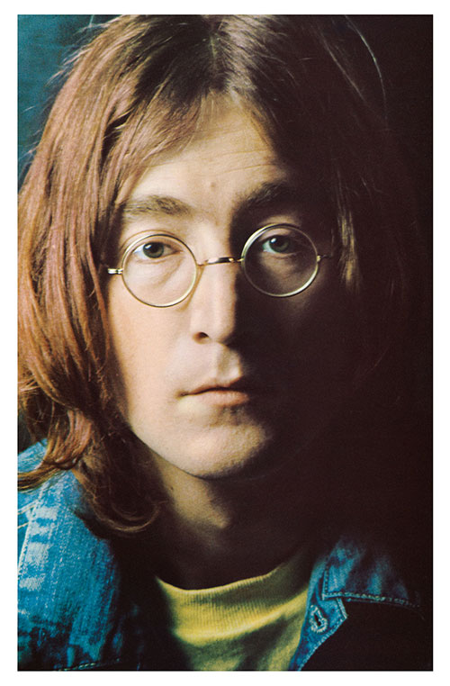
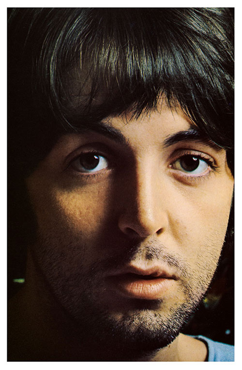
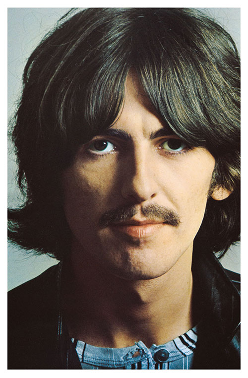
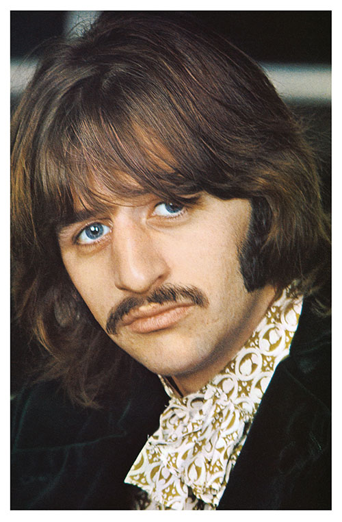
The photographs used for the portrait inserts and the inner gatefold of the album were taken during the autumn of 1968 by Photographer John Kelly.
The set of four color photographs of the individual band members were taken during the autumn of 1968 by Photographer John Kelly. Hamilton came up with the montage idea for the large free poster insert that also contained the album’s lyrics printed on its reverse side. Because each album was also stamped with an individual serial number Hamilton considered the enclosed poster a limited-edition print being circulated to millions of individuals (everyone who owns a copy of this album owns an original Richard Hamilton print) and was thus very much in keeping with the democratic aims of the Pop Art movement he did so much to start.
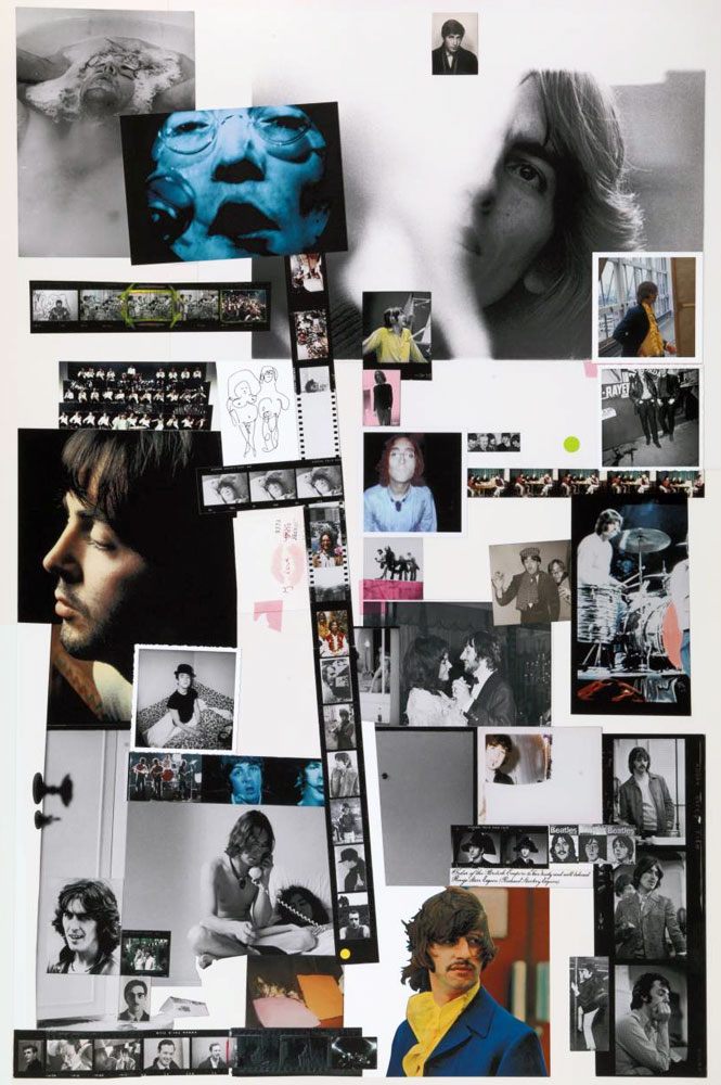
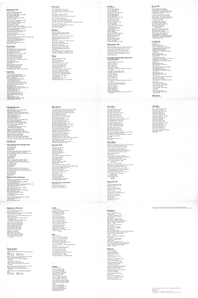
The poster contained with the album consisted of artist Richard Hamilton’s full-color photo montage on the front side, and the lyrics to all thirty songs printed on its reverse side.
The final product was a double-gatefold LP wrapped in a plain white sleeve with a heavy gloss surface; the original pressing had only two markings adorning the front of the cover: The Beatles embossed slightly below the middle of the album’s right side, slightly off-kilter and, a serial number in the bottom right corner.
Apart from being one of the greatest albums of all time, The White Album is a true cross-over between visual and musical culture. It is a work of art and an everyday object that has become part of popular culture in its own right. Through this, Hamilton bridges the gap between art and design, high and low culture, and mass production and individuality.

The LP’s first UK release had outlets at its top and was known as the Open Top cover.
The LP’s original U.K. release had outlets at its top and was known as the Open Top cover. Flaps inside the gatefold cover were visible at the left and the right sides. Early copies were issued with a protector sheet placed on the top of each photo and had a custom black inner sleeve. The music publisher’s name for George’s and Ringo’s songs was printed Apple Publishing Ltd. on the first printing and was changed afterward to Harrisongs Ltd. and Startling Music.
While John Lennon apparently claimed the album with the number No. 0000001 as his own, “because he shouted the loudest” explained Paul, it was Ringo Star who actually put the unique album up for sale in an American auction house in December 2015. Ringo’s U.K. pressing stamped No. 0000001 (because of the different numbering systems used by various plants, there are several copies of the White Album with a No. 0000001 stamp) fetched a world record $790,000.
Years earlier Hamilton, who died in 2011, recalled that he was paid around 200 pounds for his work and commented, “I thought that was a bit mean. I was surprised how little we got.”
We Buy White Albums

The White Album Inspires Artist
The Grey Album Spurs Dispute

Newly Remastered Version Of ‘The Grey Album’ Released

The Revolutionary Nature of Hamilton’s Final Design was in its Utter Simplicity
Where do you go after your last album cover broke all the rules in terms of creativity and cost? In the wake of the groundbreaking sleeve design for Sgt. Peppers Lonely Hearts Club Band, the Beatles turned once again to gallery owner and Pop Art devotee Robert Fraser.
Richard Hamilton in his studio at 25 Hurst Ave. in Highgate, London 1970. Photo: Chris Morphet/REDFERNS
As the person who had introduced the group to Sgt. Peppers designers Peter Blake and Jann Haworth, Fraser had just the man for the next Beatles project, Richard Hamilton. By the 1960s, Hamilton was showing with Robert Fraser, who was arguably one of the most influential gallerists of his era.
One of Hamilton’s most enduring series, “Swingeing London,” was based on news photos of Fraser’s infamous drug-possession arrest with Rolling Stones frontman Mick Jagger, during a party at guitarist Keith Richards’s country home. Fraser was the one who introduced Hamilton to McCartney, and, knowing he had already commissioned and rejected two other attempts at the cover art for the new album, suggested the singer hire Hamilton. While John Kelly took the portraits in the gatefold sleeve, McCartney gave Hamilton three tea chests full of photographs for the collage, Hamilton’s primary media at the time, for the poster insert.
Paul McCartney requested the design be as stark a contrast to Sgt Pepper’s day-glo explosion as possible… he got it!
~ Richard Hamilton
Hamilton explained, “Paul McCartney requested the design be as stark a contrast to Sgt. Pepper’s Day-Glo explosion as possible… he got it.” The 45-year-old artist came up with the plain white cover with the words The Beatles embossed on it, and a serial number to indicate a limited edition pressing although there seems to be some question as to whether two or five million albums featured the serial number. His earlier ideas to feature a coffee cup stain on the cover or impregnate the cover with apple pulp in honor of the newly formed Apple Corps were considered too flippant, and impractical.
However, Hamilton’s idea to call the new double album simply The Beatles was taken on board. Released in November 1968 it was immediately dubbed the White Album. The cover featured a unique stamped number, to create in Hamilton’s words, “the ironic situation of a numbered edition of something like five million copies.” Hamilton intended the cover design to resemble the look of conceptual art, an emerging movement in contemporary art at the time.
Peter Blake’s iconic sleeve design for Sgt. Pepper (1967)
Richard Hamilton’s minimalist sleeve design for The Beatles aka The White Album (1968)
Hamilton’s design contrasts strongly with the exuberantly colorful and busy cover for Sgt. Pepper designed by Hamilton’s former student, Pop artist Peter Blake and his wife Jann Haworth. Perhaps because Blake’s cover is so deeply inspired by Hamilton (it is much more Hamiltonesque than the White Album cover), Hamilton rebelled against his own style, choosing simple lines for the White Album that make it unlike most of the Pop art produced in this era, including Hamilton’s other work, and more like Minimalism.
Hamilton produced an iconic masterpiece of minimalist modern design.
~ Robert Fraser
Most assume the stark white cover that adorns the Beatles ninth LP was the brainchild of John Lennon and Yoko Ono. It’s minimalist and conceptual art influence was definitely in step with the pair’s avant-garde leanings. Lennon himself had utilized both a white canvas and white balloons in his You Are Here exhibition held July of that year at the Robert Fraser Gallery. The final cover design for The Beatles is the only sleeve of a Beatles’ studio album not to show the members of the band on its front cover.
Hamilton’s inter-sleeve design for The Beatles.
The inter-sleeve was a bit more conventional, with song titles listed on the inter-left gatefold, on the lower right, and four black and white portraits on the lower portion of the inter-gatefolds right side. As the music contained within was less a collaboration and more the result of three distinct songwriters in John, Paul, and George, so too did Hamilton’s design, with its utilization of solo shots of each band member, focus on the Beatles as individuals rather than a group.

Capitol Records released Ob-La-Di, Ob-La-Da as a single with Julia as the B-side in 1976.
The first two million copies of the LP also had an individual edition number. Copies were numbered, the same system used at all 12 pressing plants (so there are 12 1s, 12 2s, etc). Also, due to a dispute over banding (where the space between songs is visible on the record), some copies are banded and some aren’t, even between copies pressed at the same plant. No singles were issued from the album until 1976, when Ob-La-Di, Ob-La-Da was released as a single with Julia as the B-side.
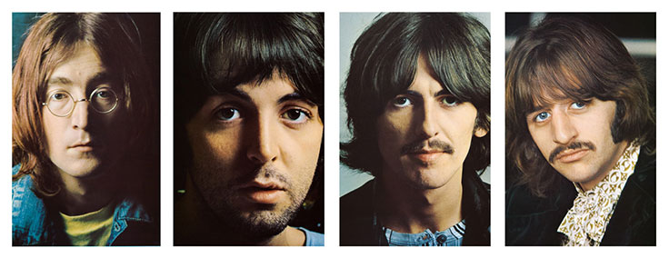
The set of four color portraits used to produce the portrait inserts and on the inner gatefold art of the White Album were taken during the autumn of 1968 by Photographer John Kelly.
The set of four color photographs of the individual band members were taken during the autumn of 1968 by Photographer John Kelly. Hamilton came up with the montage idea for the large free poster insert that also contained the album’s lyrics printed on its reverse side. Because each album was also stamped with an individual serial number Hamilton considered the enclosed poster a limited-edition print being circulated to millions of individuals (everyone who owns a copy of this album owns an original Richard Hamilton print) and was thus very much in keeping with the democratic aims of the Pop Art movement he did so much to start.
Hamilton’s poster design was included with the album.
The reverse side of the poster contained the lyrics to every song on the album.
The final product was a double-gatefold LP wrapped in a plain white sleeve with a heavy gloss surface; the original pressing had only two markings adorning the front of the cover: The Beatles embossed slightly below the middle of the album’s right side, slightly off-kilter and, a serial number in the bottom right corner.
Apart from being one of the greatest albums of all time, The White Album is a true cross-over between visual and musical culture. It is a work of art and an everyday object that has become part of popular culture in its own right. Through this, Hamilton bridges the gap between art and design, high and low culture, and mass production and individuality.
The LP’s first UK release had outlets at its top and was known as the Open Top cover.
The LP’s original U.K. release had outlets at its top and was known as the Open Top cover. Flaps inside the gatefold cover were visible at the left and the right sides. Early copies were issued with a protector sheet placed on the top of each photo and had a custom black inner sleeve. The music publisher’s name for George’s and Ringo’s songs was printed Apple Publishing Ltd. on the first printing and was changed afterward to Harrisongs Ltd. and Startling Music.
While John Lennon apparently claimed the album with the number No. 0000001 as his own, “because he shouted the loudest” explained Paul, it was Ringo Star who actually put the unique album up for sale in an American auction house in December 2015. Ringo’s U.K. pressing stamped No. 0000001 (because of the different numbering systems used by various plants, there are several copies of the White Album with a No. 0000001 stamp) fetched a world record $790,000.
Years earlier Hamilton, who died in 2011, recalled that he was paid around 200 pounds for his work and commented, “I thought that was a bit mean. I was surprised how little we got.”